
Core Data Model
Giving PBS content contributors a robust data structure so they can better curate their content, and helping PBS viewers find what they want more quickly.

The Challenge
When this project got underway, the vast library of PBS content -- combined with the very rudimentary data model PBS had at the time -- presented a number of challenges. The browsing tools that users had to sift through a show’s potentially huge amount of videos were minimal, making it frustrating and cumbersome to find what they wanted. The older data model treated a hugely popular show like Downton Abbey as small piece of a larger show called Masterpiece, frustrating users who weren’t able to find “Downton Abbey” in the navigation or search results. At the same time, PBS content contributors needed better and more specific curation control over their show’s content.
The solution was two-fold: 1) a new core data model that brought PBS’ browsable metadata up to par with our competitors, and 2) smarter content types.
My role involved Wireframes, User Flows, Visual Design, and User Testing.
Users and Audience
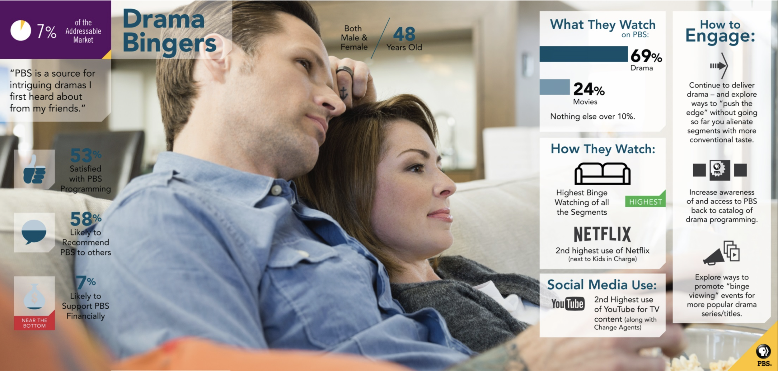
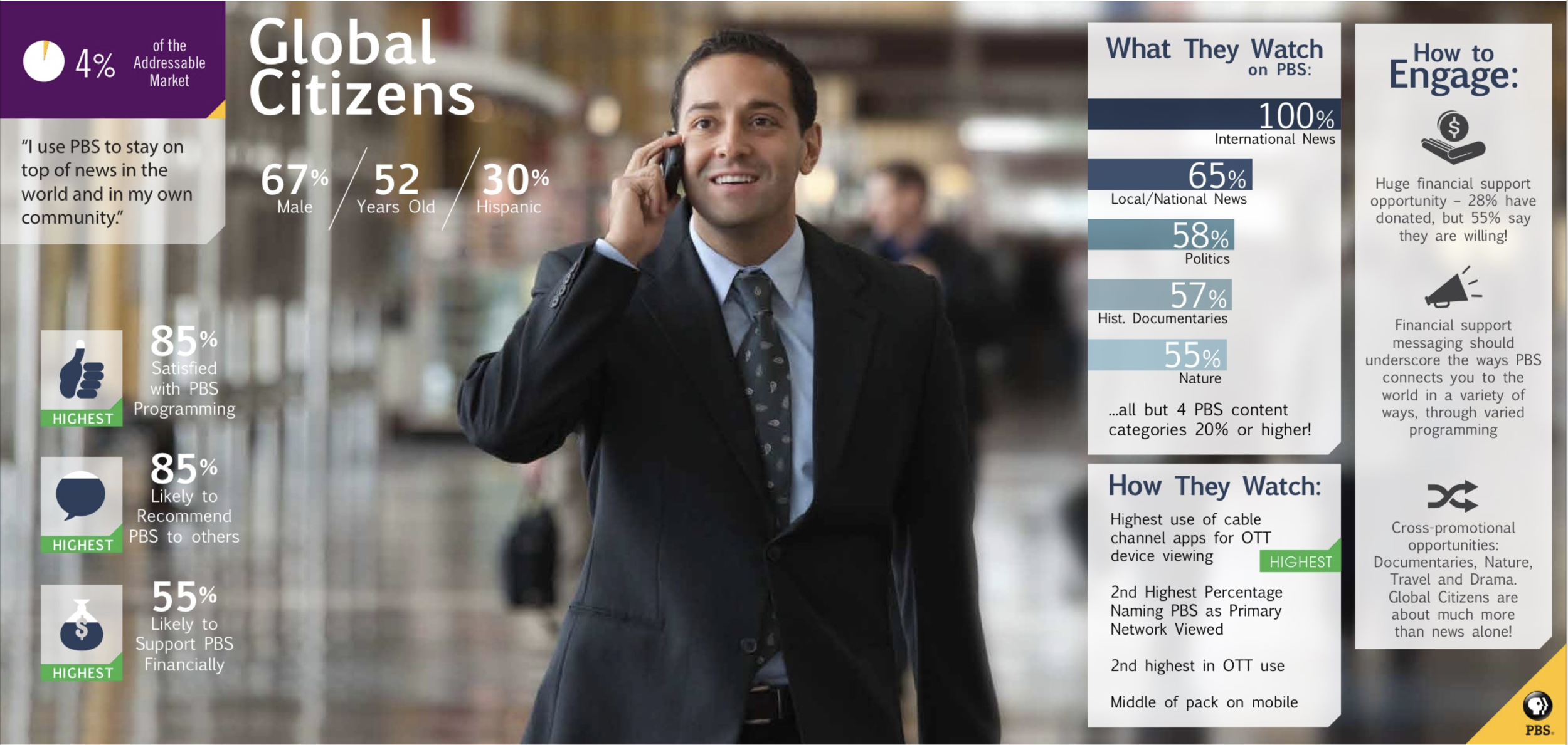
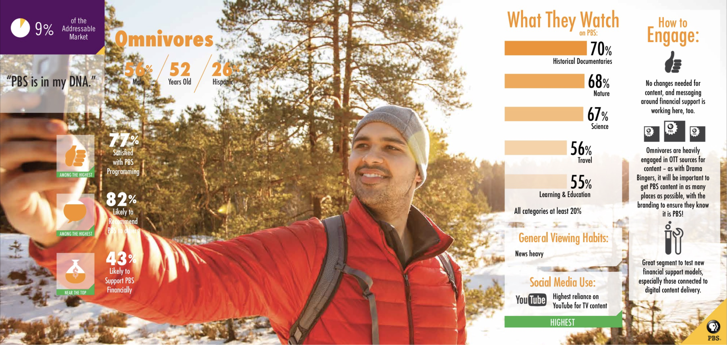
An audience segmentation study of 3000 TV and video consumers age 18-74 in PBS’ addressable market helped inform our work for this project. We identified 3 personas that had the highest mobile and OTT usage: the Global Citizen, the Drama Binger, and the Omnivore, and focused on their motivations and viewing goals.
We saw the Drama Bingers and Global Citizens as “hunters”, as they typically seek out drama or news content specifically. We saw Omnivores more as “browsers”, as they have the highest engagement across the most categories, jumping between historical documentaries, science and nature. We focused on these content areas as benchmarks and pressure tests for the new data model.
Constraints
The project scope was large, but our development and design team was small. Tasked with tackling this project on 2 mobile platforms (iOS and Android) and 4 OTT platforms (tvOS, Roku, Amazon Fire TV, and Android TV) under a limited time frame, we decided to focus on the key UX updates, prioritizing the most efficient ways to improve the experience without completely overhauling the pre-existing UIs on each platform. (The previous versions of the iOS Mobile app prior to v3.0 and Android Mobile app prior to v2.0, before the Core Data Model project, were designed by a former designer on the team, Jacklyn Laryea.)
A data model overhaul is difficult to design for; one of the biggest challenges is that the content you’re dealing with approaches infinity in terms of variability. We were faced with designing a system and UX elements that work for every existing and future piece of video content, but also has flexibility to work with all of our edge cases; and at PBS, the edge cases were exponentially larger than a typical streaming platform. Because of our unique availability windows, content was continually coming in and out of availability, and not every show fit into a clean seasonal structure.
Design Process
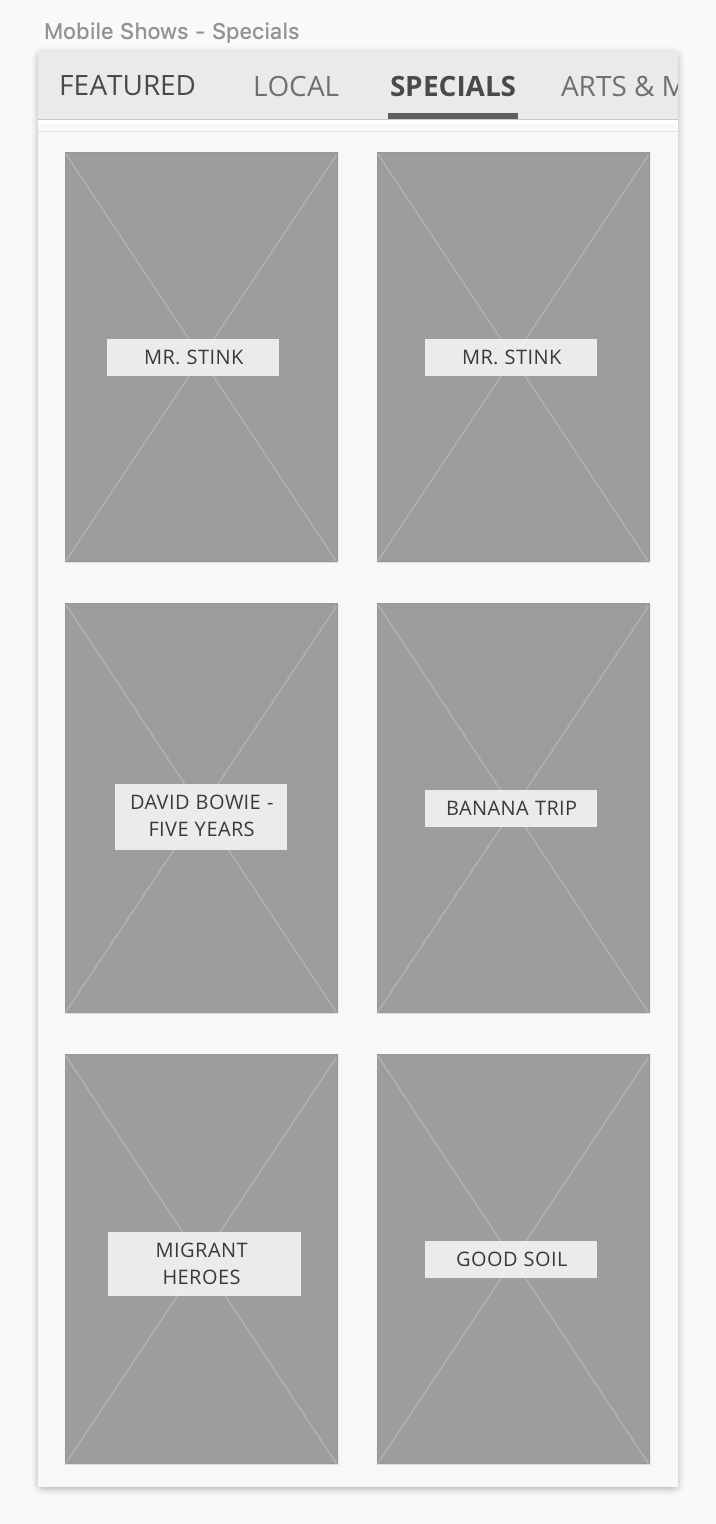
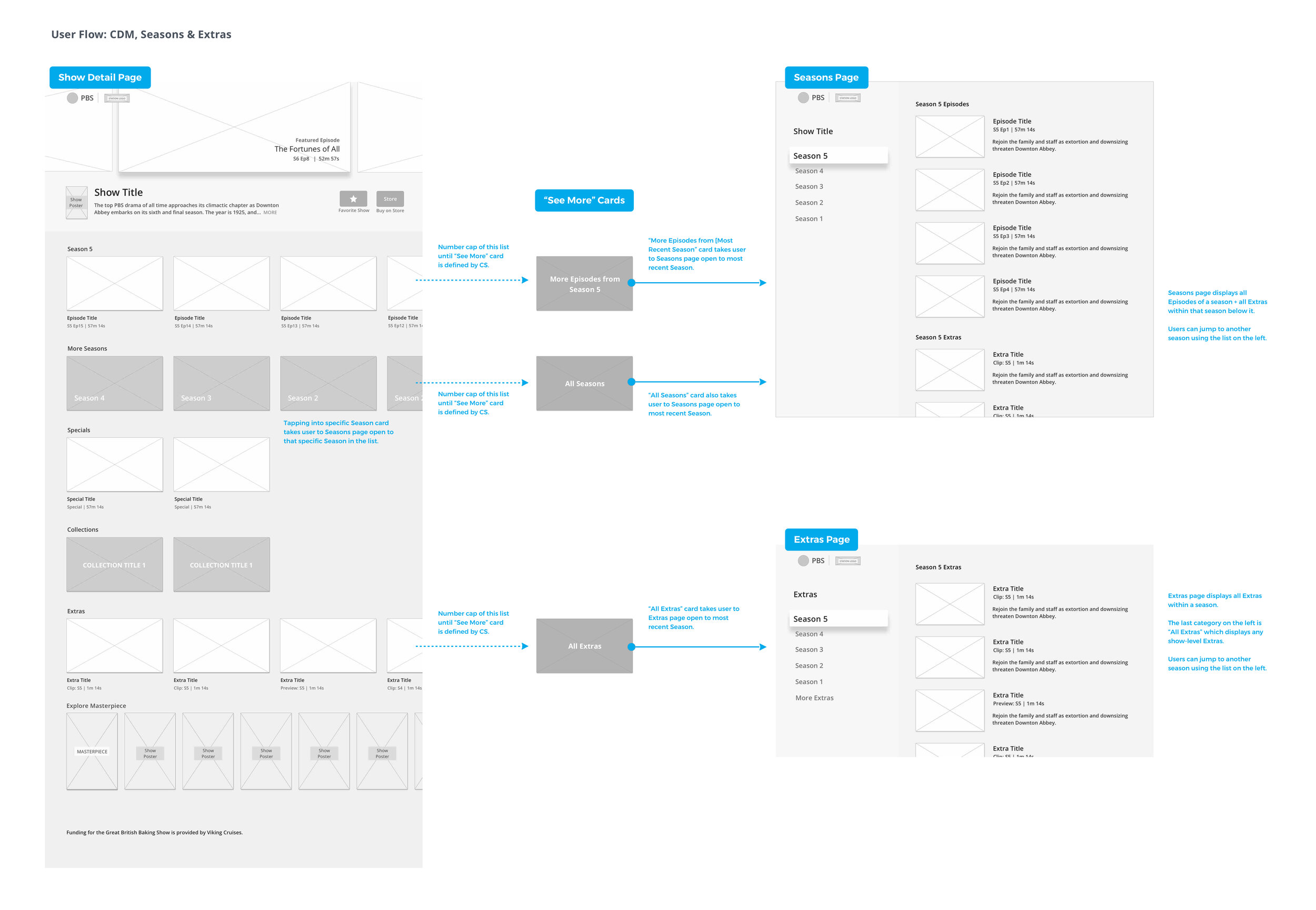
The older data model treated a hugely popular show like Downton Abbey as small piece of a larger umbrella show called Masterpiece, frustrating users who weren’t able to find “Downton Abbey” in the navigation or search results. The initial mapping of the improved model’s organization, which was more robust and multi-layered, was led by our Director of UX, Chris Koth. Along with bringing us on-par with our competitors in terms of Show-Season-Episode hierarchy, Clips and Previews were now able to hang at any level. This also established 3 new content types that allowed for more flexibility: Franchises, Collections, and Specials.
Franchises (e.g. Masterpiece) served as a content type sitting above a show, serving as an umbrella structure for groups of shows coming from the same producer (e.g. Downton Abbey, Sherlock). Collections could be leveraged as thematic groups of content that producers could curate their content around (e.g. “Texas, New York, California” Collections for Antiques Roadshow). Specials could be leveraged as any content that sat outside of a regular Season (e.g. Holiday Specials for Call the Midwife).


We had 2 main UX goals for an improved experience: 1) Can we help “hunters” more efficiently find what they’re looking for?; and 2) Can we help “browsers” discover new content they’re interested in?
Chris Koth and I whiteboarded on the IA together to best leverage the new model and boost discoverability from video to video:

Wireframes
With these foundational pieces in place, I spent several weeks on the project in the wireframe phase. Keeping things lo-fidelity allowed us to iterate through the user flows quickly and get them right.
I focusing the wireframes on mobile first to validate that the more complex data structure would work on our smallest screen. Mobile also had our largest user base at the time.


The wireframes mapped out an originally more complex interface with varying sizes and unique design patterns for to particular content types like Specials. After rounds of design review and stakeholder feedback, I realized that I was overcomplicating the UI and adding too many layers of filtering structures for content types like Clips that just weren’t needed. These wires also overloaded users with too much information, such as show descriptions and video counts on “See All” views.
For Round 2, I designed multiple platforms simultaneously to make sure patterns would work across handset, tablet, and TV.


Refinements and User Flows
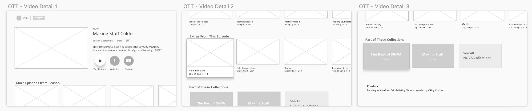
The refined set of wireframes focused on simplifying as much as possible. I made the video pattern for Episodes and Specials consistent, after realizing that only the big feature areas needed to be visually weightier in the hierarchy of the page. I removed any superfluous filtering structures that were unique just for Clips, combined Clips and Previews into an umbrella “Extras” for shorter-form content, and leveraged the same season picker for Episodes and Extras to streamline the sorting mechanism. For tablet and OTT, a split-screen view was a more efficient use of space, removing an extra selection just to switch between seasons.
After some user testing, we also decided that intermingling Franchises and One-Time Only Specials (like a longer feature film) with “regular” Show Posters was the right move on places like the Shows by Genre screen, as users viewed them as one and the same.
Visual Designs
With our new smarter content types in place, we designed corresponding new UI patterns that would be consistent and recognizable across PBS.org and any of our apps: an updated Main Video pattern, a Collection card, and a Special.


Before and After
Comparing what our Show Detail and Video Detail pages looked like before and after the Core Data Model UX updates were implemented, you can see that the “After” allowed for richer experiences that solved for varying content needs across shows. The UX updates worked well for shows that fit a classic seasonal structure, like dramas, while also working hard for shows that had more specialized needs. A documentary-based show like POV could leverage the full suite of Specials for their StoryCorps Shorts and Collections for themes like Feature Films and Short Films.
We also took advantage of this opportunity to make other improvements, such as utilizing show logo branding, expand/collapse functionality for long show descriptions and funder information that were previously pushing video content way down, and boosting discoverability from show-to-show with “You Might Also Like” recommendations based on genre.
Final Screens
A snapshot of new screens that were implemented with the Core Data Model UX updates, including Franchises, Seasons flow, and Collections:
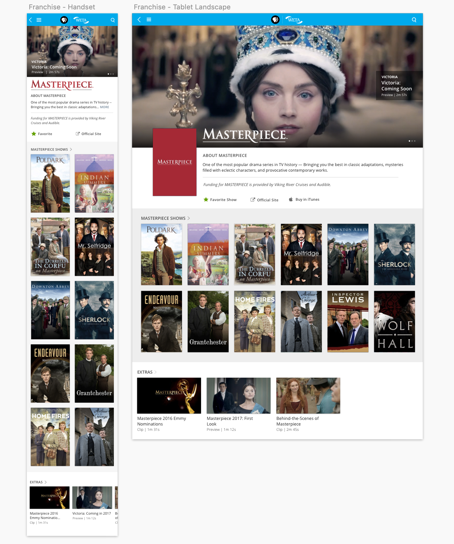


The visual designs for handset and tablet are below. For the full case study on how the core data model was implemented on tvOS, read that here.
If you’re on a mobile device, access the mobile prototypes via the links.
If you’re on a desktop, click or tap on any of the first 4 show posters below. Follow the hotspots into how the new UX updates were integrated:
Outcomes
Our measures of success for this project focused on engagement, frequency, and reach. In the first 3 months after these updates were released across mobile and OTT, we saw:
10.9%
Overall increase in the average number of streams per user
7.7%
Overall increase in the number of sessions per user
14.8%
Overall increase in the number of returning users
Team Members
Chris Koth (IA, User Flows, UX); Jeff Tubb (Product Management); Developers: Denis Ujavca (iOS, tvOS), Andrei Boleac (Android, Android TV, Amazon Fire TV), Daci Romian (Roku); Susan Frazier and Eliza Jacobs (Audience Segmentation Study)
The previous versions of the iOS Mobile app prior to v3.0 and Android Mobile app prior to v2.0, before the Core Data Model project, were designed by Jacklyn Laryea.